Fleet Portal Design System
Setting up a scalable foundation for growth

Quick Glance
ROLE
Lead UI/UX Designer
TEAM
Designer, 1 Eng, Product Manager
DURATION
8 weeks
TOOLS
Figma & Notion
Fleet Portal Design System
Laying the foundation for a scalable, self-serve fleet platform 🛠️✨
While leading the design of Sun Day’s new Fleets Portal, I built a scalable design system from the ground up — creating a consistent foundation that streamlined workflows, improved customer experiences, and fueled long-term growth and scalability.
*During my time at Sun Day, I worked on projects & databases that I cannot disclose due to NDA restrictions. Please contact me for more information.
Context
👀 OVERVIEW
Every new page or feature post-MVP needed design decisions from scratch — slowing down myself, dev, creating inconsistencies, and risking user trust.
It wasn’t just about colors and buttons — it was about setting the whole project (and team) up for success. 💪
Problem
📉 THE CHALLENGE
After the MVP handoff, we didn’t have any UI patterns or visual standards in place, which led to an inconsistent experience across screens. Every new feature meant re-creating components, more QA, and slower dev handoffs.
If we wanted to grow, we needed a real (and organized) foundation.
Opportunity
💡 INSIGHT
What if we could make it ridiculously easy for anyone to design or build a new screen — and have it look and feel totally on-brand?
What if devs could move faster, and users got a smoother, more trustworthy experience?
That was the dream. And I got to bring it to life.
Design Process
📝 DISCOVERY & RESEARCH
First up, I took a deep dive into the existing portal designs to see what was working and where we could improve.
-
Pulled together all existing screens / designs
-
Identified gaps, inconsistencies, and friction points
-
Conducted QA on existing MVP


✍️ FOUNDATIONS
Next, I laid the foundation for everything by defining some core colors, typography styles, spacing, and grid system.
I actually started with some good old-fashioned math and sketching on paper first, mapping out different spacing scales and layout ideas. After double-checking and refining it, I built a clean, concise grid guideline


🧩 BUILD & SYSTEMIZE
With foundations in place, it was time to start pulling everything together into a clean, scalable system in Figma. I followed a version of atomic design thinking by Brad Frost, breaking things down into simple building blocks (atoms), more complex groupings (molecules), and larger sections (organisms).
I defined our Atoms as the core pieces—tiny things that shouldn’t be changed, but instead used to build bigger components.

Molecules combined those atoms into functional components like form fields, dropdown menus, or card layouts.
I used variants and booleans to make sure these molecules were flexible and easy to work with for different use cases, while still staying consistent.
I created organisms by assembling molecules into full sections like navigation bars, card layouts, and data tables, all ready to be dropped into full pages.

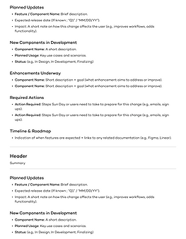
I finalized organizing all the components into the scalable Figma library you see above—designed to be easy to navigate and flexible enough to grow with future needs.
I didn’t just stop at building components. I also created detailed usage documentation to make it easy for both designers and developers to understand how (and when) to use each piece. To keep the system running smoothly over time, I added dedicated pages in the design system file for release notes and upcoming changes, so the team could easily track updates, plan for new features, and stay aligned without any surprises.


The Final Design System
I worked closely with engineering to integrate components into the codebase.
I walked eng through detailed specs, Figma pages, and real-world usage examples + pages to aid in a smooth handoff and implementation.
Outcome & Results
🥳 SOLID IMPACT!
Setting a strong design foundation made everything (and everyone) faster, happier, and more confident.
Impact we saw on the engineering side:
-
Faster dev cycles for new features, thanks to ready-to-use & consistent components.
-
Fewer back-and-forths during handoff, since everything was clearly documented and standardized.
-
Smoother internal QA processes, leading to fewer bugs / visual inconsistencies.
Impact on design Iterations & Feature Releases:
-
Shipping new pages & features was quicker without having to reinvent the wheel.
-
Consistent components meant less decision fatigue and more time spent solving real user problems.
-
Clear visual standards helped align design and product teams faster, reducing rounds of revisions.
100%
onboarding adoption rate for designers & developers
60%
perceived time saved during QA & design-dev collaboration
20%
faster feature delivery
Reflections
🌟 PERSONAL IMPACT
Design systems have always been a passion of mine — and this project reminded me why I’m such a strong advocate for them. I’ve worked with design systems in the past, both as a contributor and as a user, and I know firsthand how much of a difference they can make in the speed, consistency, and overall quality of a product.
Getting the chance to lead and build one from the ground up was incredibly meaningful to me. It combined so many things I love about design: problem-solving, creating structure out of chaos, and collaborating across teams to make everyone's work better (and easier). Building this system wasn’t just another project, it was an investment in the future of a product I had helped design from start to finish, and in the success of the teams who would keep it growing!
🩵 TAKEAWAYS
Here are a few awesome things I learned along the way:
-
Think ecosystem first, not just components. A good design system isn't just a collection of parts, it’s a way to create consistency, speed, and confidence across teams.
-
Lay the groundwork early. Spending time upfront organizing the file structure, naming conventions, and documentation saves so much time (and confusion) later.
-
Collaboration is so important. Getting early and frequent feedback from developers and product team made the system stronger & made adoption much smoother.
-
Expect to evolve. No matter how polished the first version feels, real-world use will always reveal new needs, gaps, and opportunities for improvement!
-
Celebrate the small wins. Every small piece — a well-organized library, a positive handoff, a faster QA cycle — added up to big impact.